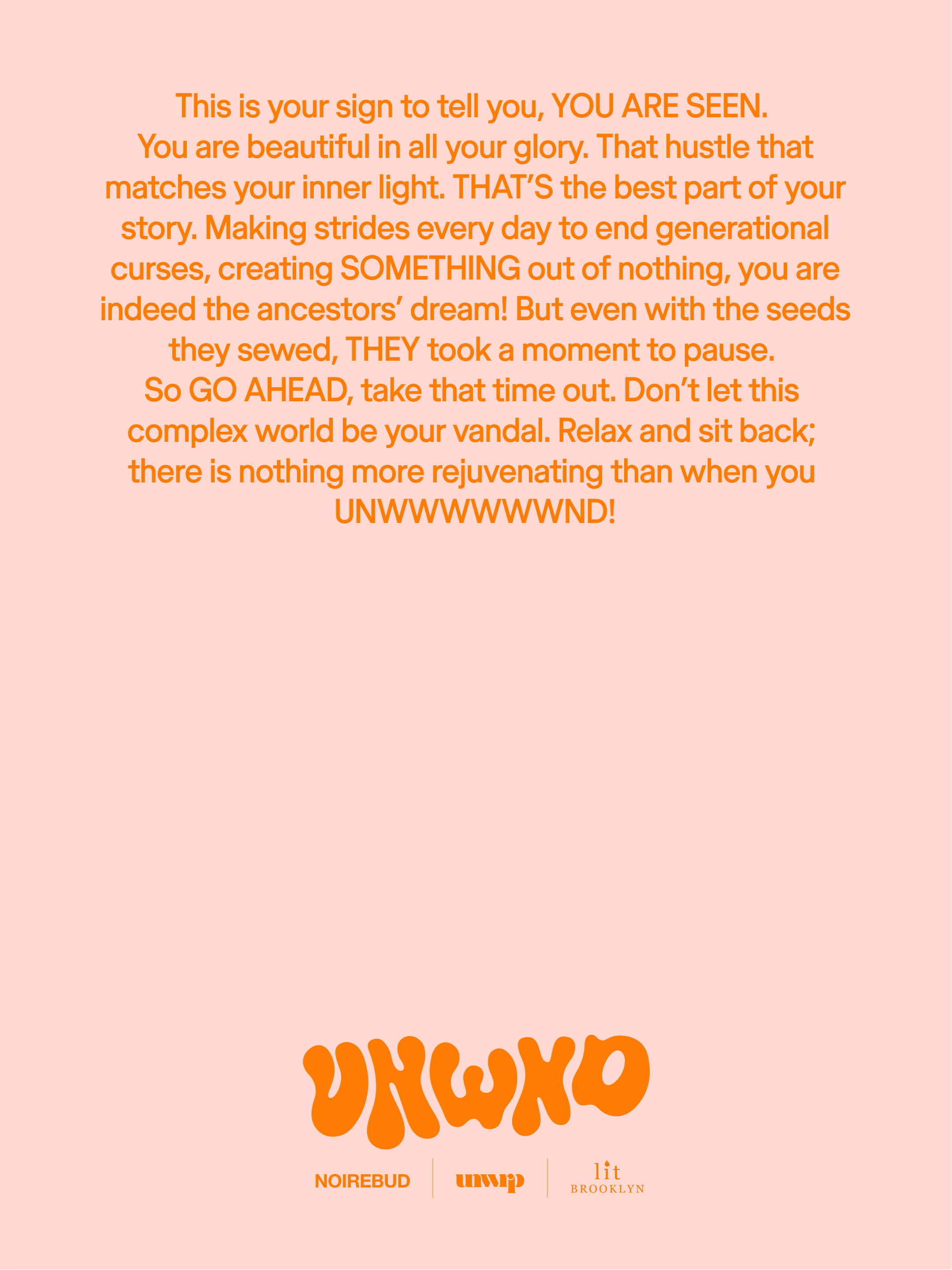
UNWND
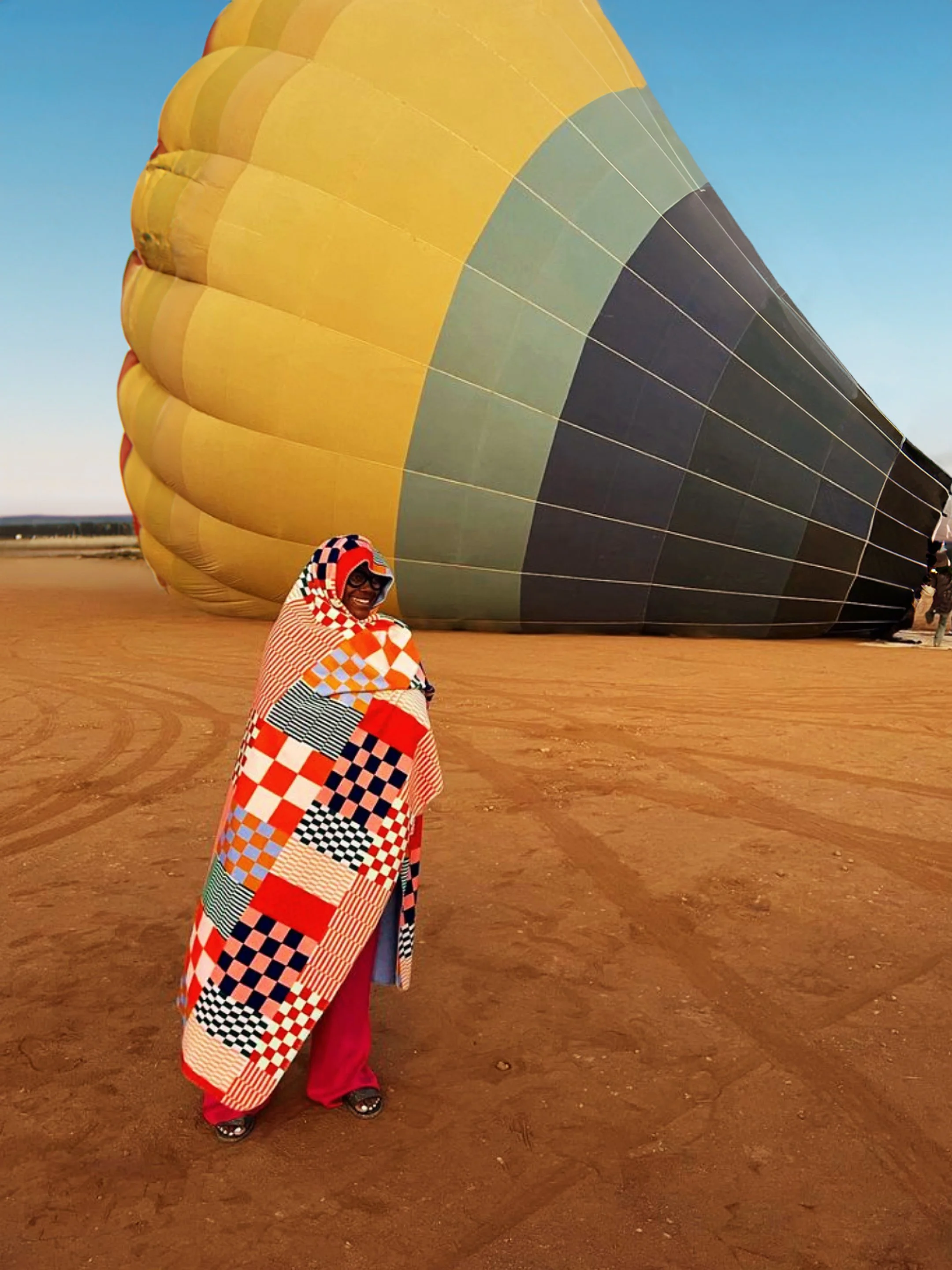
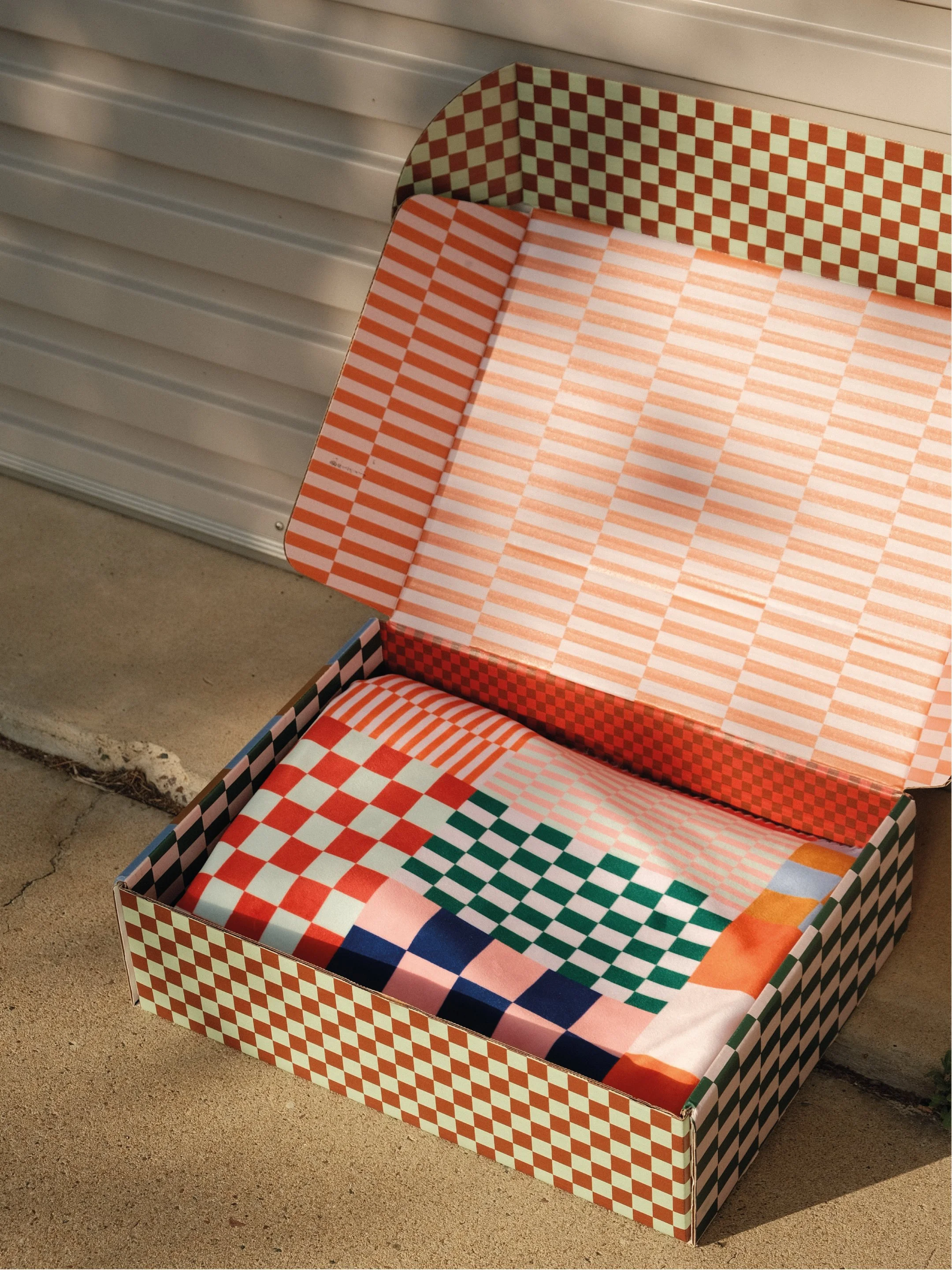
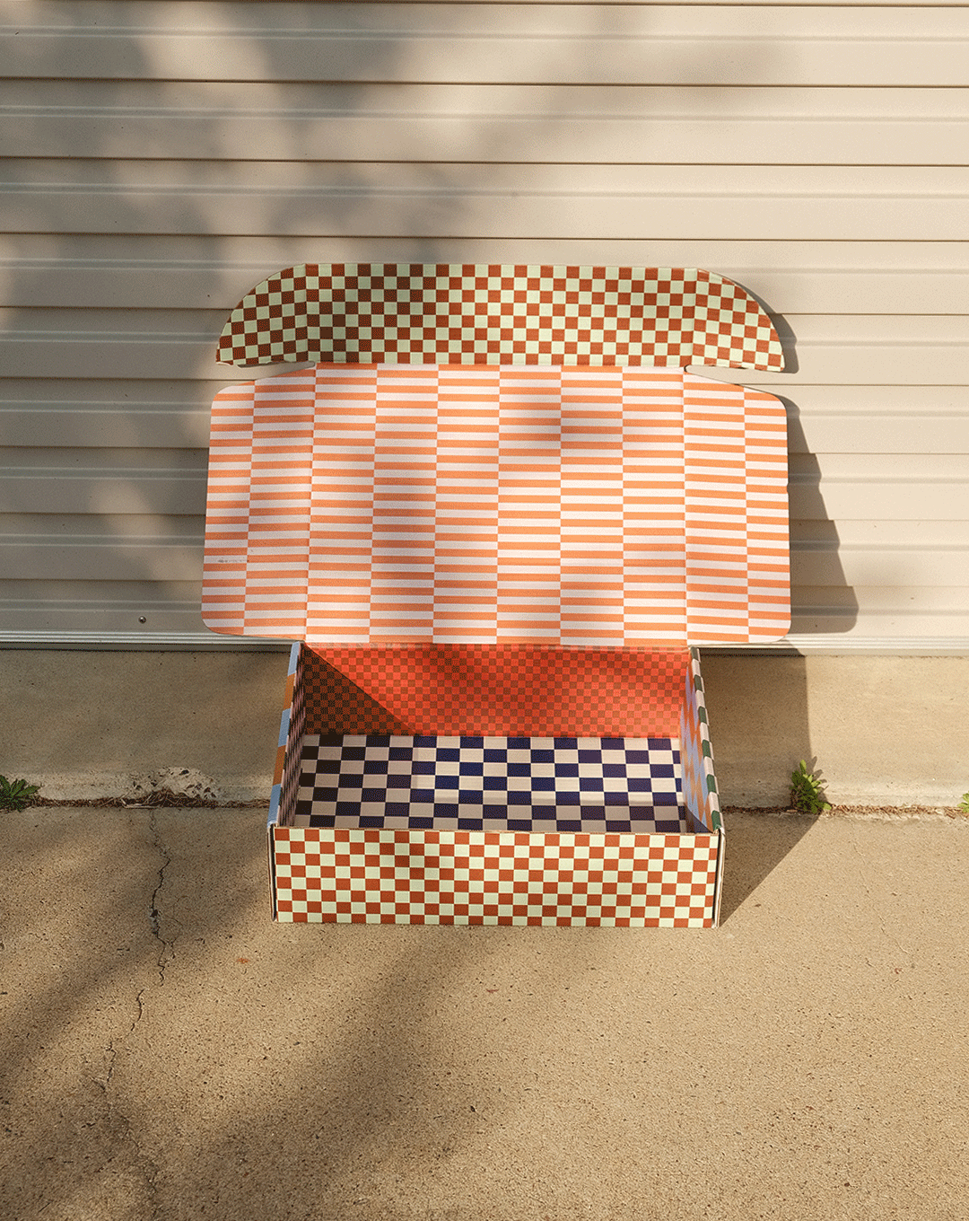
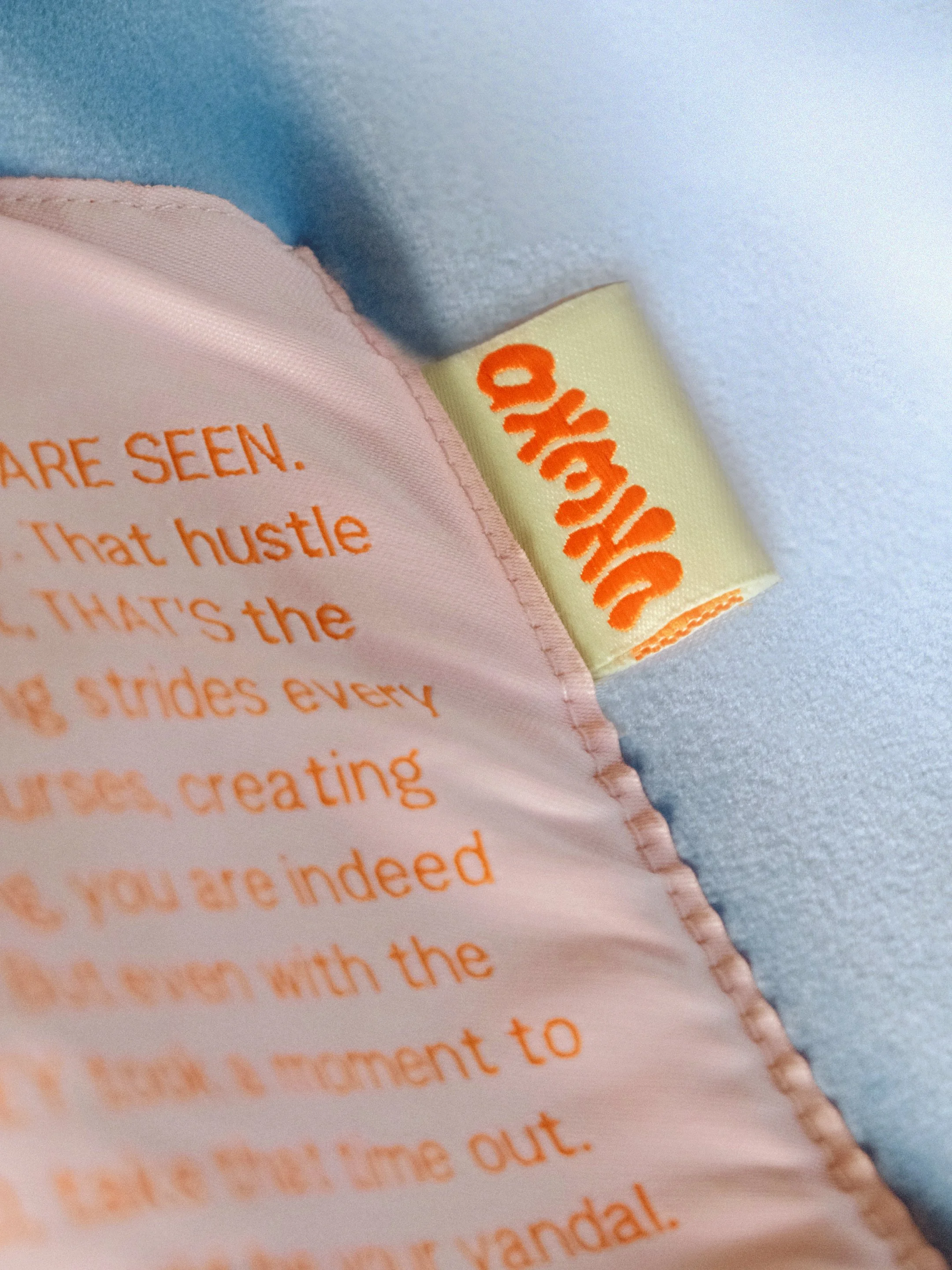
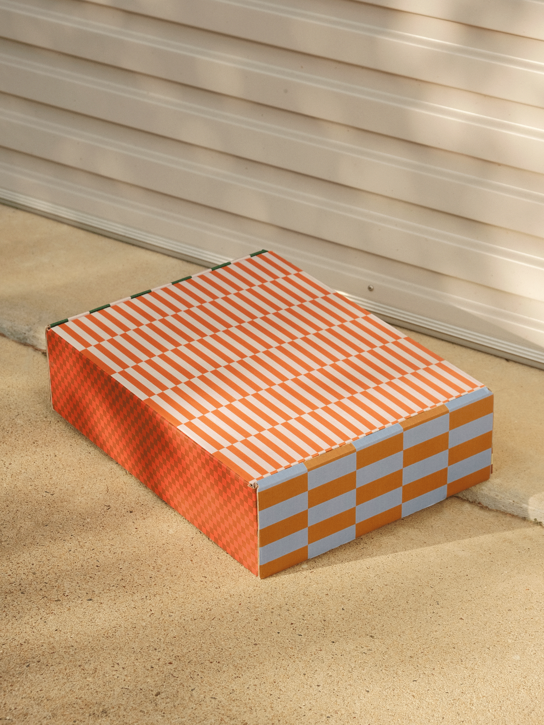
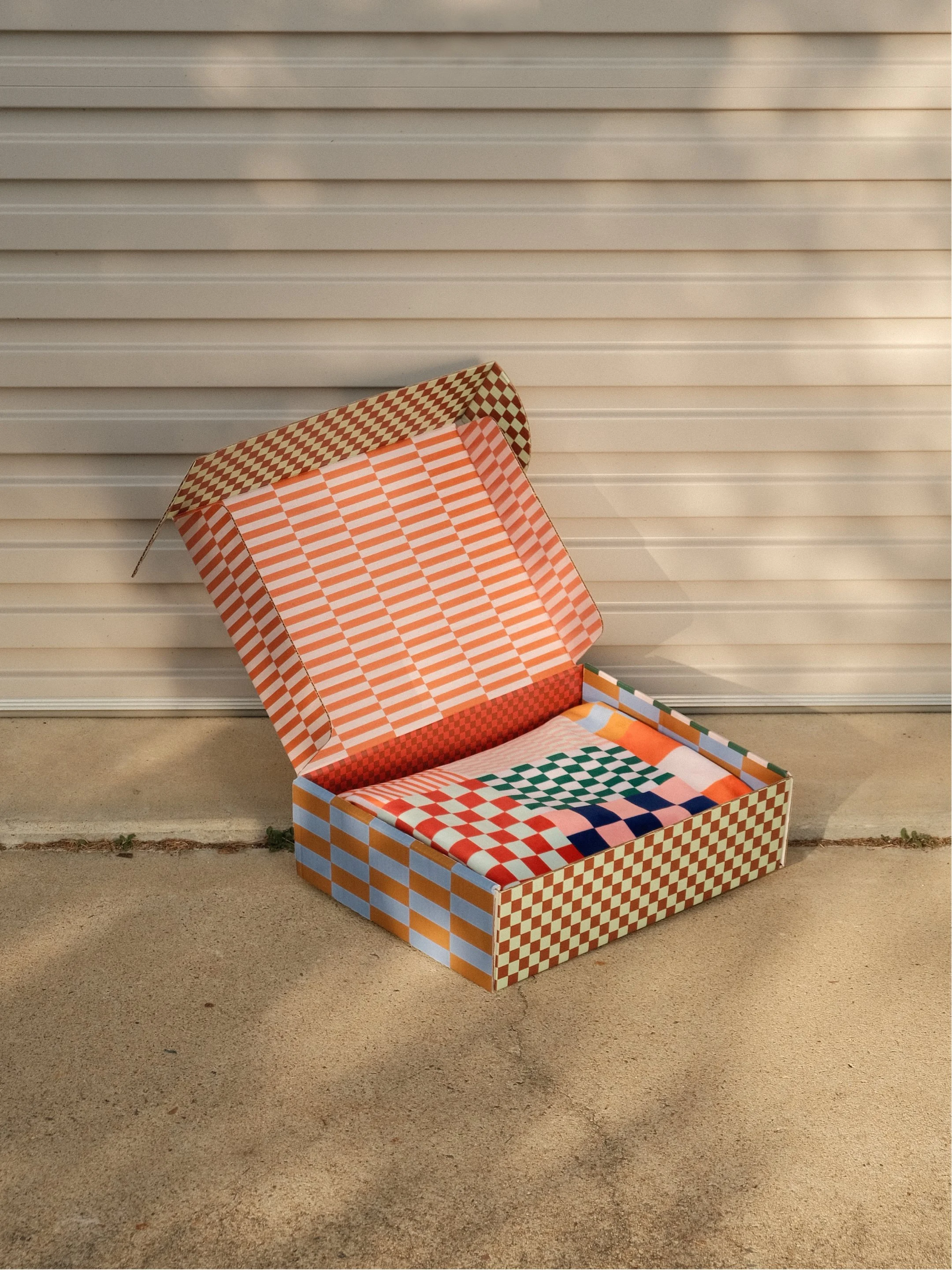
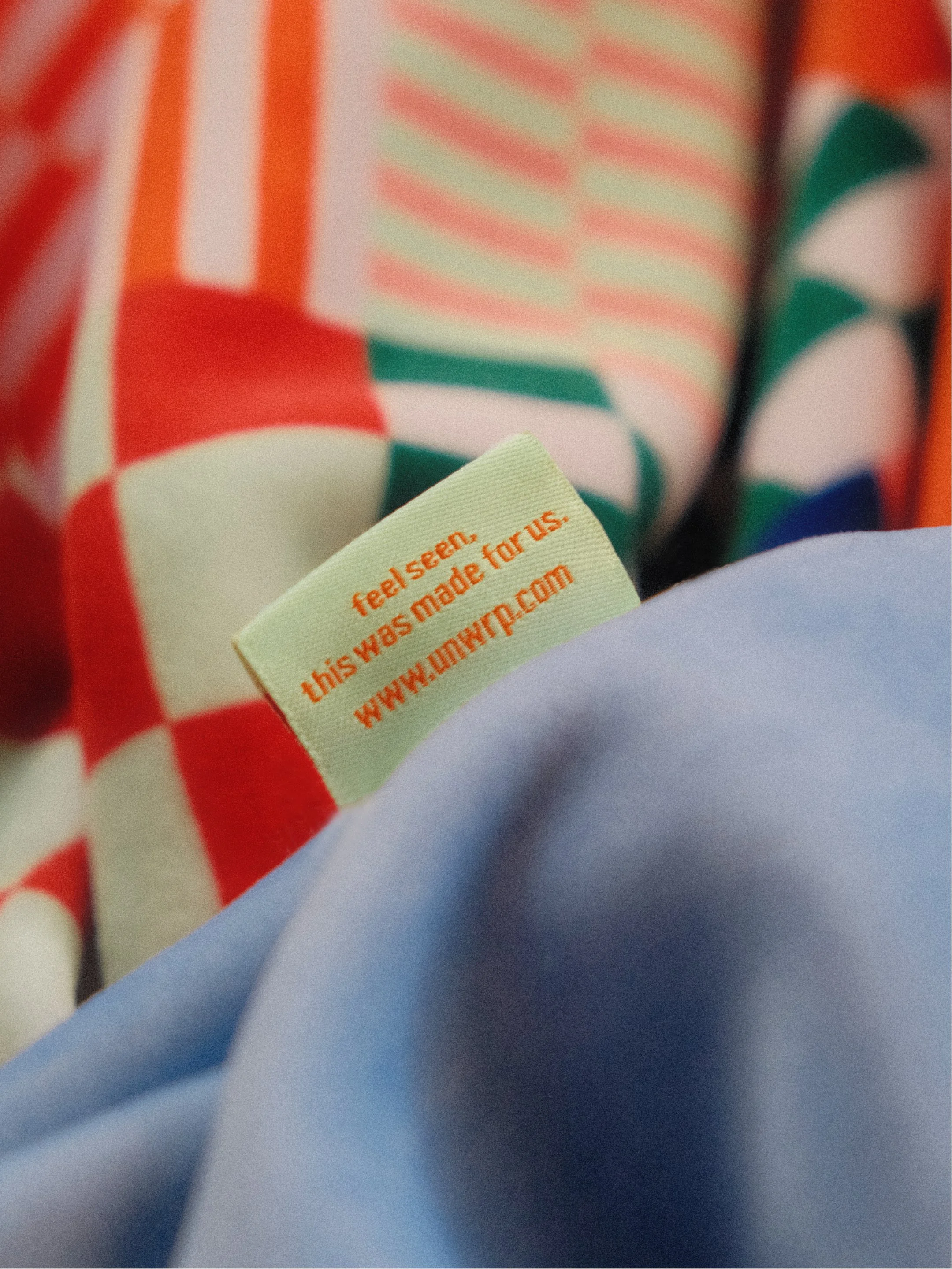
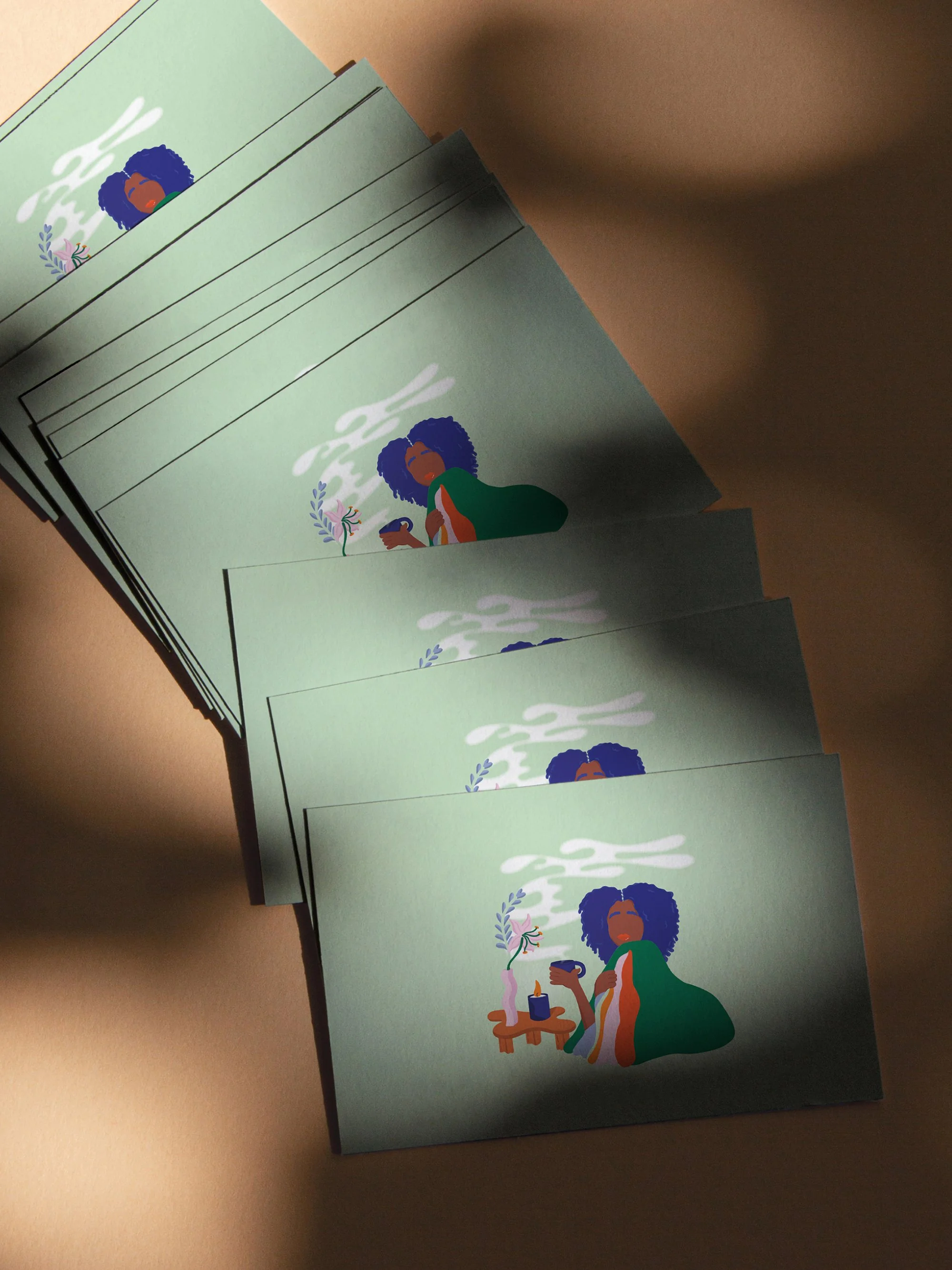
UNWND is a product collaboration between UNWRP, NOIREBUD and lit Brooklyn. The three NYC-based businesses were looking to collaborate for years. UNWRP are known for the bold, colourful patterned gifting pieces. NOIREBUD for their CBD luxury product line, and lit Brooklyn for their handpoured candles. Together their brand collaboration, UNWND, is centred around relaxation. We designed a new UNWRP pattern for their weighted blanket, as well as the identity and packaging for the project.
-
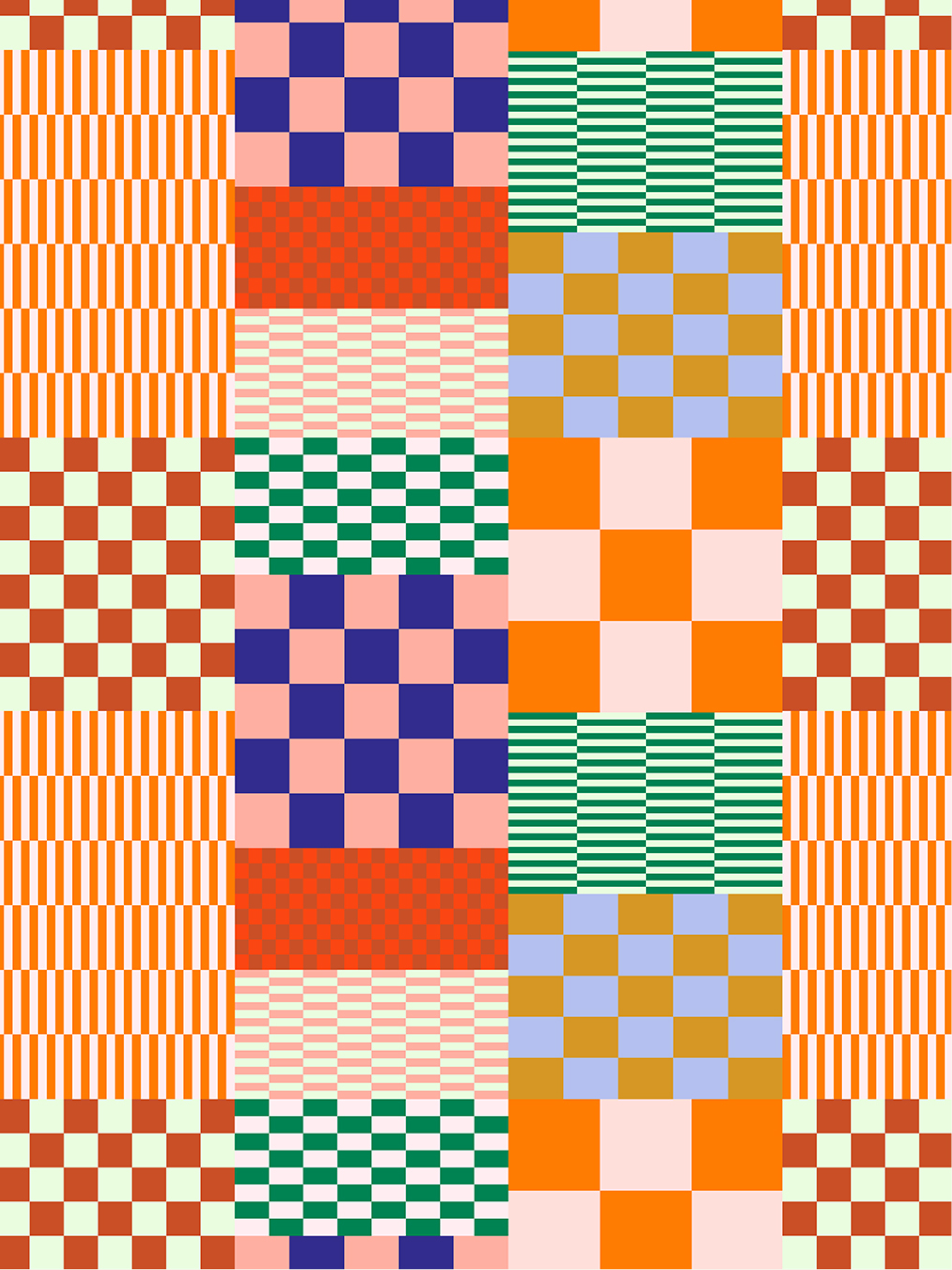
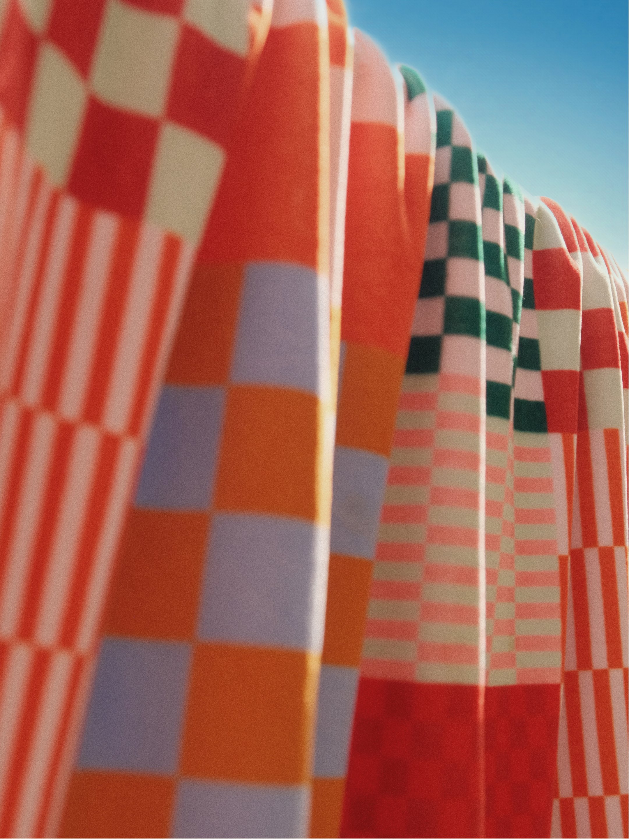
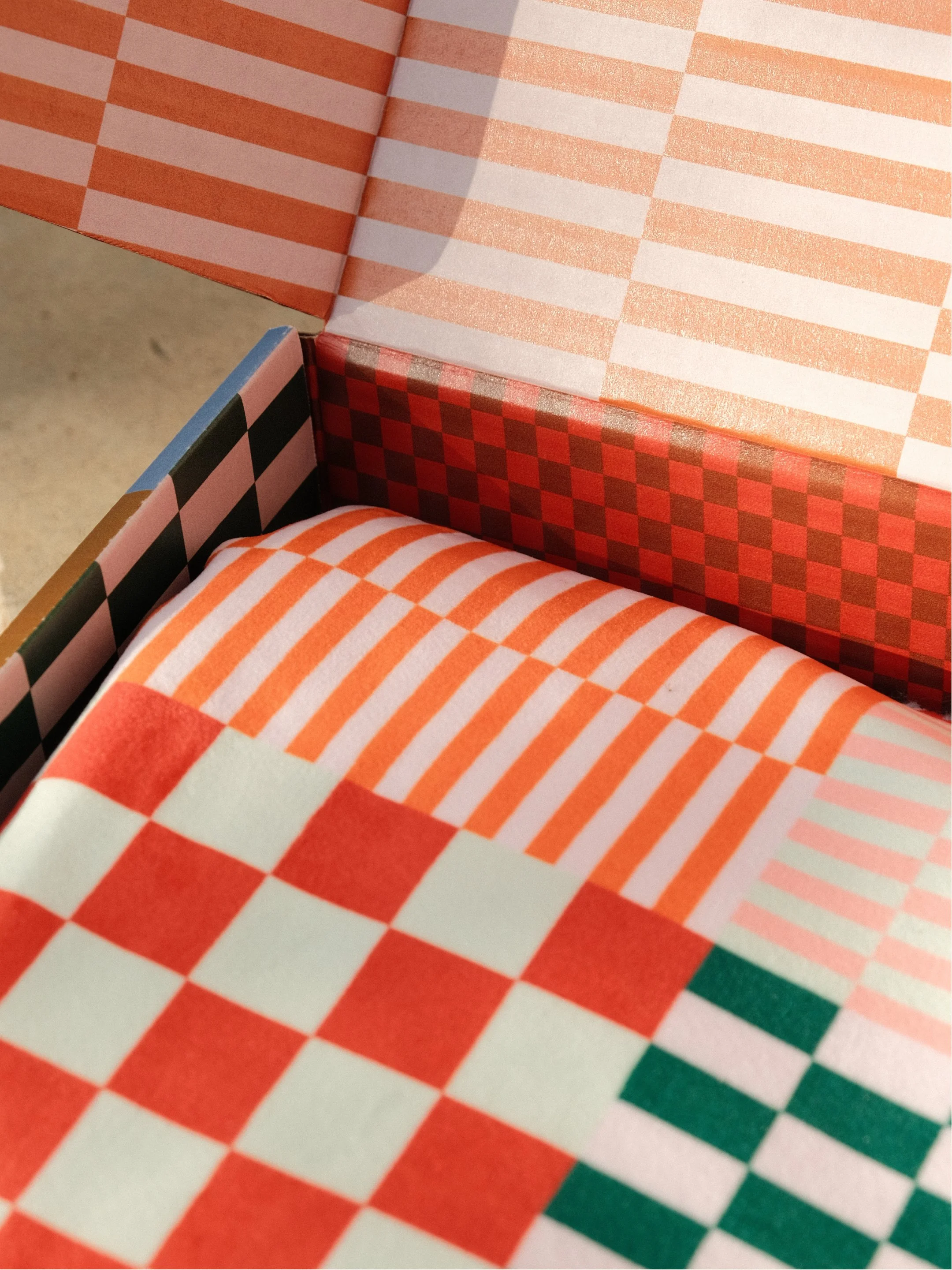
The UNWND wordmark is a oozy, malleable lettering, with each individual word leaning into the other. A softness reflective of the tea, candle light and blanket that make up the collection. It sits alongside a bold colour palette and satisfyingly complete checkerboard pattern. The palette is eclectic,with the UNWRP brand’s navy meeting an array of warm and cool tones.
The identity is built around the projects goals of relaxation and a celebration of individual character. Not everyone finds peace in neutrals. Leaning into the bold colour palette’s UNWRP is known for, we produced a best selling pattern and sold out collaboration.
The UNWND project was a collaboration of 3 proudly Black-owned businesses.
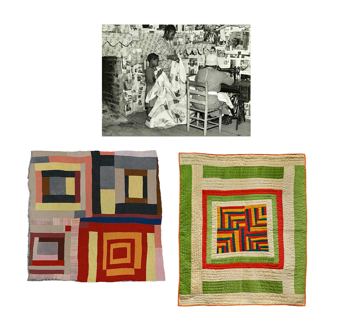
We started off the project designing the print for UNWRP's blanket. The pattern grew from research into Gee's Bend, a small, isolated, and historically significant African American community in Alabama, renowned for a rich quilting legacy. Rooted in a tradition dating back to the nineteenth century, Gee's Bend quilts were born from necessity and community; often crafted from old work clothes, flour sacks, and repurposed pieces of everyday life.
What sets this tradition apart is its improvisational spirit, with each woman stitching her unique vision of the world into vibrant abstract patterns, intuitively reimagining the colours, shapes, and rhythms familiar to her in daily life. Our grid pattern draws from this energy, where the sections have their own motif, yet everything holds together. Colour and pattern working in harmony.
For African Americans, quilting not only preserves memory through repurposed fabrics, but also plays a vital role in assertion. It is a medium to claim identity and bring beauty into life. A spirit of resilience and creativity.
PRODUCTION
UNWRP
PHOTOGRAPHY
Emma Hursey
CREATIVE DIRECTION
Doing Me Doing You, Ashley London Fouyolle
DESIGN
Doing Me Doing You
COPY WRITING
Carolyn Gray
2022